With the current coronavirus spread, there has been a lot of information and data about the state of things. Using my engineering and data analysis background, I offer my presentation of the data.
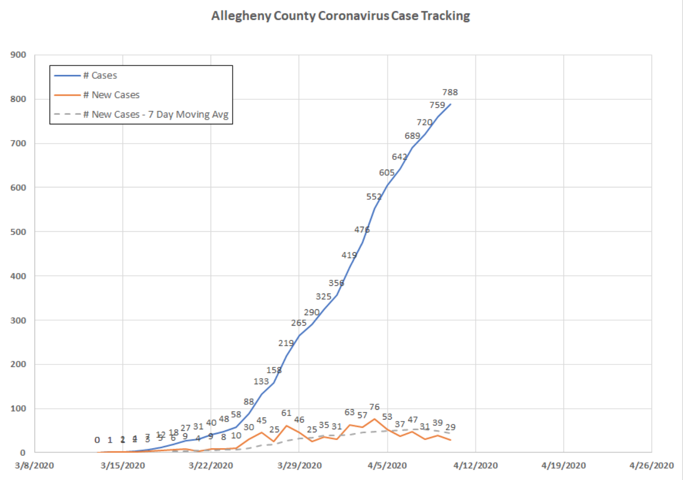
Every day, Allegheny County (Pittsburgh) issues updates on the number of cases. I put this data into a spreadsheet to look for the “curve flattening” that we all want to see.
Well, great news! The social distancing, hand-washing, and avoiding face touching are working! The data says so!
In the chart below, BLUE is the total number of cases. ORANGE is the number of new cases. GRAY shows the 7-day moving average of number of new cases. I am showing that curve because you can actually see that the 7-day moving average has FLATTENED and is now DECREASING!
Also interesting are patterns in the reporting, where Saturdays and Thursdays always show spikes in cases. I believe this has something to do with the channels through which the cases are reported.
Keep this up, stay diligent, and soon we will be able to return to normalcy!
Stay safe everyone!